I’m Sophie, a communication design team lead and art director

  • HSE Art and Design School 2016–2020
  • Bureau Gorbunov 2025
  • Stanford School of Humanities and Sciences 2026
  1. 2026BlaskTeam Lead
  2. 2024Sobytie CommunicationsArt Director
  3. 2023Independent PracticeBrand Designer
  4. 2021Elari TechDesign Director
  5. 2019ElariJr Art Director
  6. 2017Independent PracticeBrand Designer
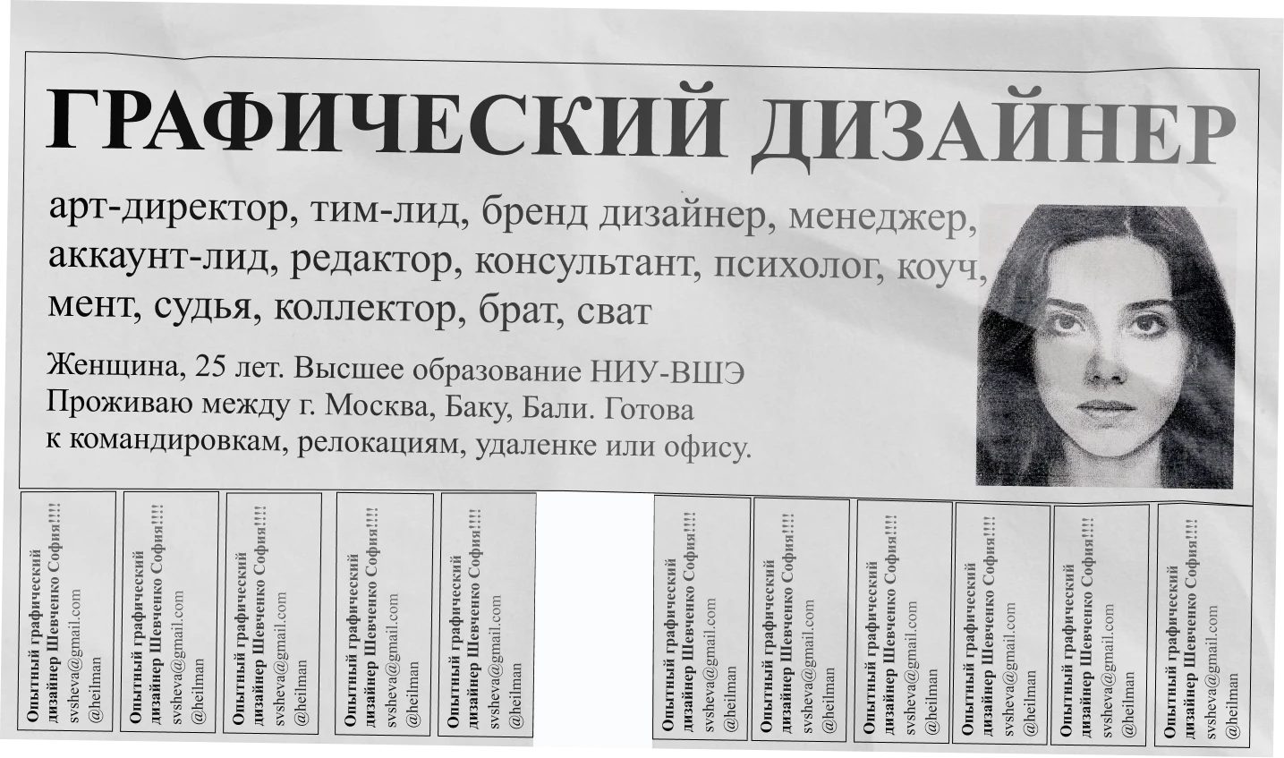
A tear-off street flyer in Russian: “Graphic designer. Art director, team lead, brand designer, manager, account lead, editor, consultant, psychologist, coach, cop, judge, debt collector, brother, matchmaker. Woman, 25, HSE graduate. Living between Moscow, Baku and Bali. Ready for business trips, relocation, remote or office.” The tear-off tabs read: Experienced graphic designer Sophia Shevchenko, svsheva@gmail.com, @heilman. One tab is already torn off.
10Years in visual communication
50+Projects in that time. Eight are shown here
02Books researched, typeset, printed and sold
3 daysBranding in three days. The fastest we’ve delivered for a client

Work(08)

  1. 01Theatre of Mimicry & GestureIdentity2020
  2. 02BlaskIdentity · In-house2023 — now
  3. 03Beach Soccer CupEvent identity2022
  4. 04NastaIdentity · E-commerce
  5. 05RUSAL #ProSportEvent identity2023
  6. 06Special projectsCreative · Illustration2021
  7. 07Sign Language in Art and DesignBook · Research · Type2020
  8. 08Symbols of Secret SocietiesBook · Research · Type

01 / 08

Theatre of Mimicry & Gesture

Identity · 2020

The X is a crossed-out mouth, an envelope and a window at once. Every photograph of the actors’ hands sits inside it.

Client
A Moscow theatre where Deaf actors perform. Its line: a theatre that speaks to you in another language.
Role
Identity design, art direction
Scope
Sign, type system, posters, tickets, programmes, website, social, merch, wayfinding

One sign, three readings

The X says ‘no sound’, ‘a message’ and ‘look here’. It needs no translation, which is the whole point for this audience.

A language you read with your eyes

Hands, faces and quiet serif type. Red wavy underlines mark words the way a teacher marks speech, the only colour in the system.

From ticket to staircase

The same frame scales from a ticket stub to a poster wall and the stairwell of the venue.

Research first

The identity grew out of a study I wrote alongside it: Sign Language in Art and Design, a book about how gesture has been drawn, printed and designed.

Read on Calaméo ↗

02 / 08

Blask

Identity · In-house · 2023 — now

The # is a tag, a grid and a ranking. For a company that sorts a whole market, it became the data mark.

Client
An AI market-analytics platform for iGaming. Today it tracks 4,800+ operators in 133 markets.
Role
Rebrand in 2023; since 2024 in-house art director and team lead
Scope
Mark, colour and type system, website, social, product visuals, OOH, merch

Finding the sign

Monograms, abbreviations and symbols were tested before the # won. The search is in the gallery below.

Data as material

Charts, rankings and dashboards carry the brand as much as the logo does.

Client side

I stayed in-house to build the design team that runs the brand day to day.

03 / 08

Moscow International Beach Soccer Cup

Event identity · 2022

A flame that is also a ball in flight. Sand, heat and speed in one stroke.

Client
An international club tournament at CSKA Arena, 13–16 October 2022.
Role
Identity design, brand book
Scope
Main and kids’ marks, pattern, medals, trophy box, accreditation, uniforms, arena banners, broadcast site, tickets, press wall
Result
Used live at the tournament. The photo of the winning team lifting the cup is real, not a mockup.

04 / 08

Nasta

Identity · E-commerce

The N is the target’s flight path, the moment before the shot.

Client
A Russian manufacturer of clay targets for sport shooting.
Role
Identity, online store, brand book
Scope
Mark, pattern, packaging, apparel, posters, web store

05 / 08

RUSAL Festival #ProSport

Event identity · 2023

Every sport gets a tile. Put the tiles together and they cover a whole city.

Client
An annual sports festival RUSAL holds in 14 Russian cities for Metallurgist’s Day and Miner’s Day.
Role
Identity design
Scope
Lock-up, sport icon set, tile pattern, posters, billboards, merch, medals, tickets, stage

One line everywhere

“Together, to new records!” runs across billboards, medal ribbons and tickets.

Built for 14 cities

The pattern takes any city name, any headliner and any format, from a bottle label to a stage screen.

06 / 08

Special projects

Creative · Illustration · 2021

Give people a game about something they already argue about.

Client
Yandex Eats, Yandex Lavka and Vizit.
Role
Concept, art direction, illustration
Scope
Web specials, quiz and game mechanics, characters, social

Yandex Eats · Something with Something

A quiz of strange food pairings that sorts you into six gastro-types, from gastro-optimist to gastro-ascetic. All characters drawn by me.

Yandex Lavka · Okroshka: Battle of the Century

Kefir or kvass? The oldest argument of a Russian summer, turned into a vote.

Vizit · Happy Protection-from-Children Day

For a condom brand on 1 June: a chat game where a timer runs until the knock on the door. People argued about it for years. For this brand, that was the brief.

07 / 08

Sign Language in Art and Design

Book · Research · Type · 2020

Written alongside the theatre identity in case 01, as its research: how gesture has been drawn, printed and designed.

Read the book on Calaméo ↗
Client
My own research title, published under Radio Puritans Press.
Role
Research, writing, type design, layout, print
Scope
The 33 letters of the Russian fingerspelling alphabet, 76 matched posters, a gesture typeface

08 / 08

Symbols of Secret Societies in Logos

Book · Research · Type

Lodges and orders left their marks in corporate logos. I traced them and built a display face out of the symbols.

Read the book on Calaméo ↗
Client
My own research title, published under Radio Puritans Press.
Role
Research, writing, type design, layout, print, sales
Scope
Book, display typeface built from society symbols, poster
Result
Printed and sold through my own channels.

Side notes(02)

Packaging · Illustration · 2020

Tizzi Cup

A menstrual cup by Tizzi × VkusVill × Samokat. Small identity, box and illustrations that say the word everyone avoids. Plus My 2020 Calendar, a gift poster set for couples and singles.
Identity

Her Mom’s Café

MONO, a small café in Haifa: smoothies, coffee and kosher home baking. Hand-set letters, loud colour, and the line “In dough we trust”.

About

I love my work. If you feel the same about yours, we’ll get along.

01

Research before the design

Before I draw anything, I dig into the subject: its history, its vocabulary, how people actually use it. The idea usually comes from there. Sometimes the research stays in a notebook; for the theatre it became a whole book.

02

Boring categories deserve loud work

Menstrual cups, condoms, clay targets. Where everyone plays it safe, being noticed is the cheapest media buy.

03

I still make things myself

I draw, set type and print my own books. It keeps my direction honest: I never ask a team for something I couldn’t do.

Have a brand that needs its one sign?